
Bright vs Dark Cover Art: Which One Performs
The question comes up constantly, and the honest answer is that it is not really about dark versus bright. It is about contrast and detail. Here are the five things that reliably make a cover get scrolled past.

1. Flat, monotone or black and white
The eye likes colour and contrast, and skips images it finds dull. This is where the dark-versus-bright question actually lives: a dark cover with real contrast works, a flat one does not. Try it yourself — open your feed and notice which images pull your eye and which you slide past.
2. Poor source photos
Compare recording a song on headphone mics with recording it in a studio. The result is obvious in both cases. Dark photos from an old phone are the most common thing that sinks an otherwise fine cover.
3. Too little detail
When the eye catches on an image it wants to keep looking. If there is nothing further to find, interest ends there. Detail is what converts a glance into attention.
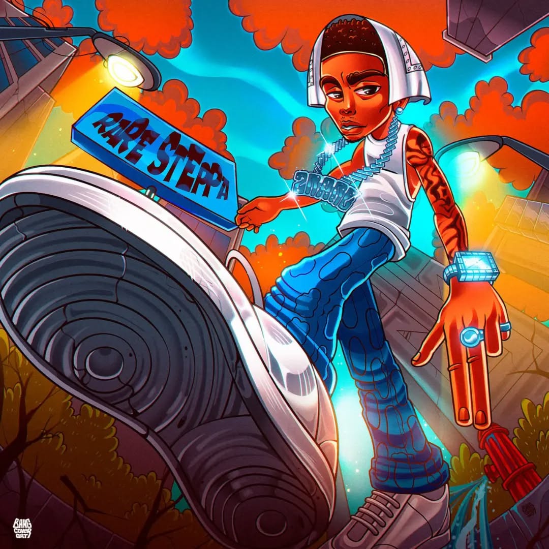
4. Boring scenes and concepts
With no legend or story in the cover, and no interesting angle from the designer, the eye gets tired of a flat image and moves on to something better.
5. Visible inexperience
An unpractised hand shows, and every visible mistake works against you. A novice tends to hide errors behind dull, desaturated colour — which is exactly why so many weak covers end up dark, and why the colour question gets confused with the skill question.
So which should you choose?
Choose contrast and choose detail. A bright cover is harder to execute — holding a saturated image together takes real work — but a dark cover done properly stops the scroll just as well.
Want this done for you?
We have delivered over 4,600 covers since 2019 — digital, 3D, cartoon, underground, motion, logos and merch. Tell us the style, the deadline and the budget, and you get an offer back.
Get Price Calculation →